Creating swarms with scatter plots
Using the strategy defined in this post, you'll be able to create charts showing the distribution of data over time.
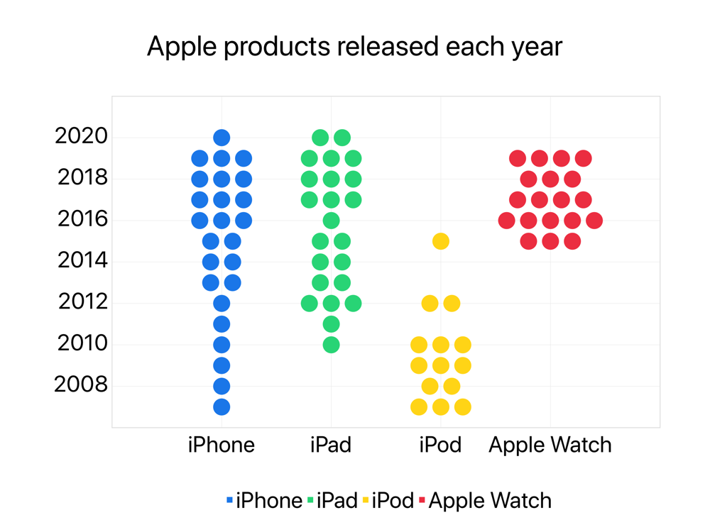
The idea here is to get how many products Apple released eah year and create this distribution over time. In order to understand how this is done, we'll split our shortcut into 3 parts: setting up, calculating and plotting.
Part 1 - The setup

Each part will be split in four, and you can follow along inside the shortcut as there are comments mirroring the names of each section here.
Setup diameter of each dot
Each of the our products will be associated with a specific x value: 1 for iPhone, 2 for iPad, 3 for iPod and 4 for Apple Watch.
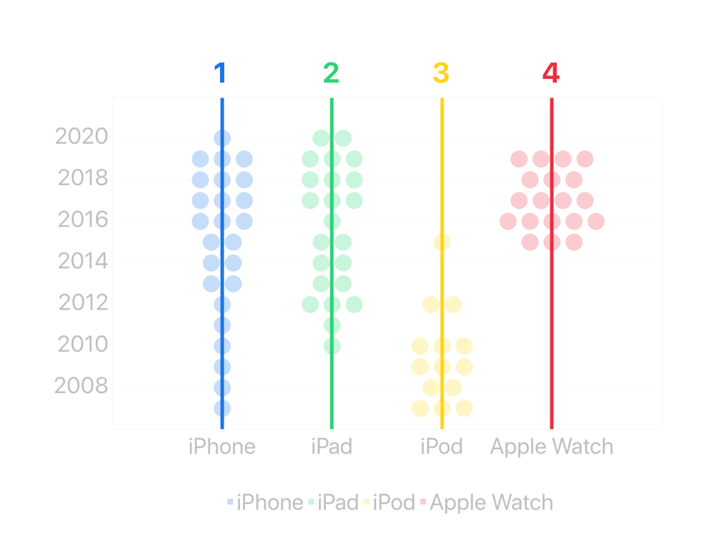
For each year, we'll have to add a number of points equal to the number of products released that year. Calculating the y coordinates of these points is easy, as it's just a sequence based on the years. But for the x coordinates, we'll need to calculate them based on the number of points in each row, moving them left or right.

This is where the diameter parameter comes in. If we have three points in a row, as shown in the image above, the first one will have an x coordinate of the base product x minus the diameter, the second point will be right over the product base x, and the last point will be shifted one diameter to the right.
Setup vertical labels (years) and setup horizontal labels (products)
These are just conventional text actions, containing one line for each of the years and one for each of the products. This is necessary to guarantee we'll be going through the years in the correct order.
Setup data (JSON)
After scouring this wikipedia page, I've built a JSON dictionary to store our information.
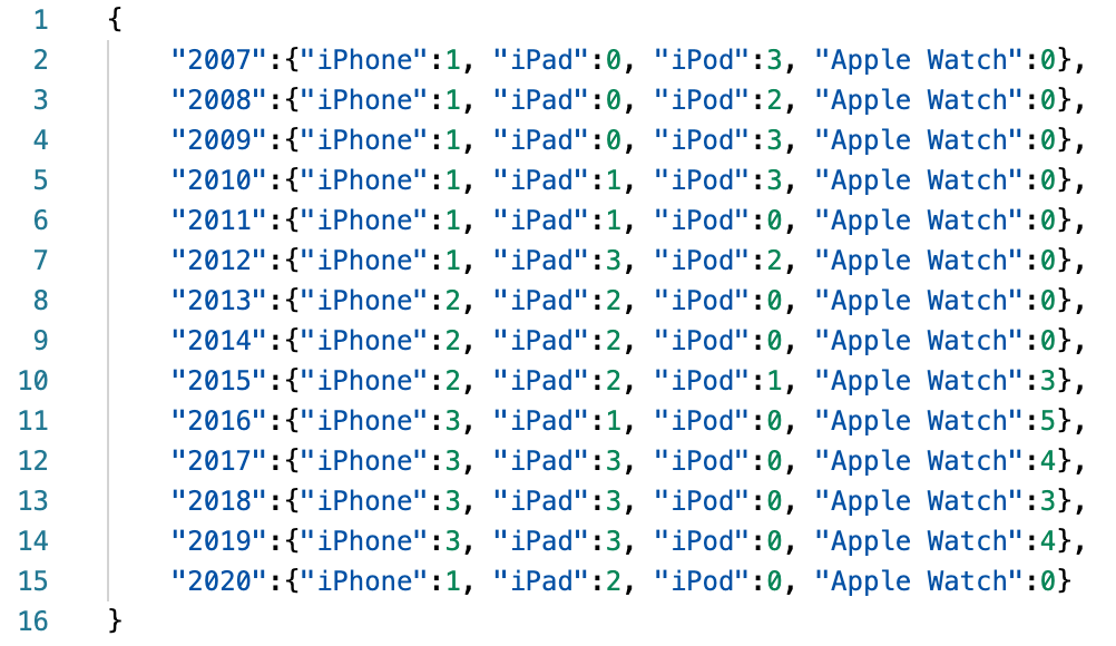
Part 2 - The calculations

Part 2 happens entirely inside a repeat loop that's ran once for each of the years we've defined as our vertical labels.
At first, I wanted all these sections to be another repeat loop, iterating over our products list, but I couldn't come up with a strategy that allowed me to do this, mostly because of how Shortcuts handles variables.
As I'm writing this, I'm thinking it might have been possible using Data Jar, so as an academic endeavor, I'll leave this test to you: my dear reader.
Each of these sections get the number of a given product released in the current year and calculates the corresponding x and y coordinates, based on what we discussed above, adding them to 4 different series. As you may already have guessed, 4 series are needed because we want our products to have different colors.
Part 3 - The plotting
After the repeat loop, we proceed to the chart creation. It's a very conventional scatter chart with 4 different series, and we use two Style Axis actions to format both axes using custom labels.
Don't be scared when you open your newly created chart in Charty, because there's still something we need to do: modify the export profile. This is needed to guarantee we get the best chart dimensions associated with the best markers size, so everything looks correctly. Below is a screenshot of my very obviously named Export Profile: swarm.
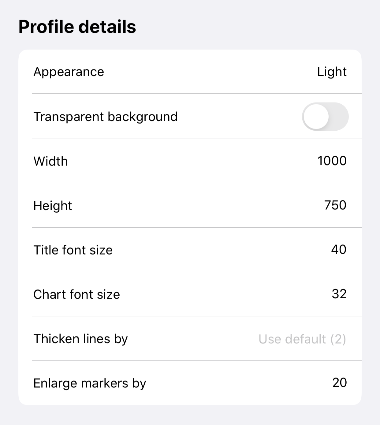
And here is our final result, and a link to download this shortcut. This strategy can be used to create this kind of chart for any dataset you can build, you'll spent most of your time modifying the setup, and will have to update your calculation blocks with the name of your x labels.

This shortcut requires Charty 1.1.3 and also uses Charty's premium actions