How to add custom labels to an axis
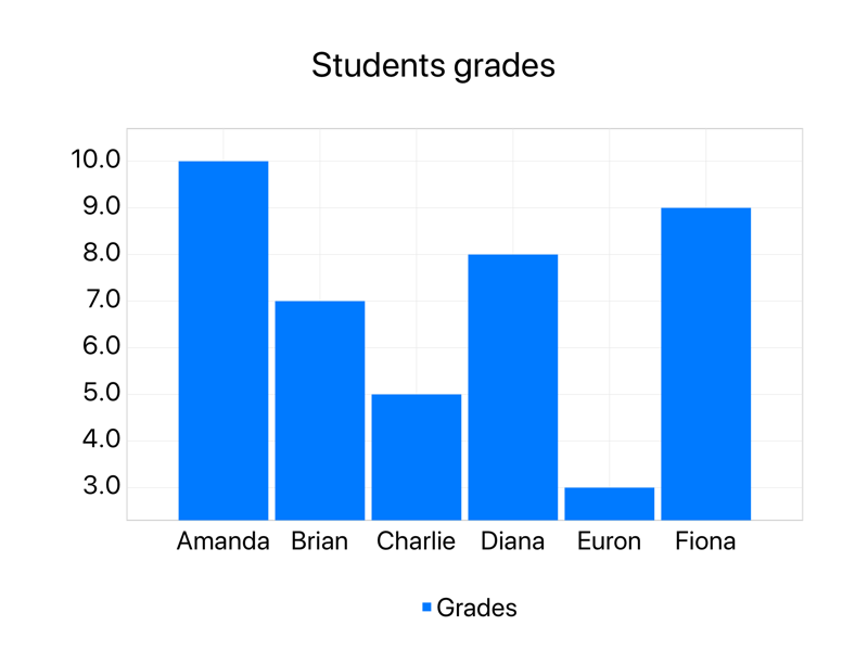
It's possible to have custom labels on the x axis using the Style Axis action. In this tutorial, we'll be going through the steps necessary to create a bar chart of students grades with the name of each student in the x axis.
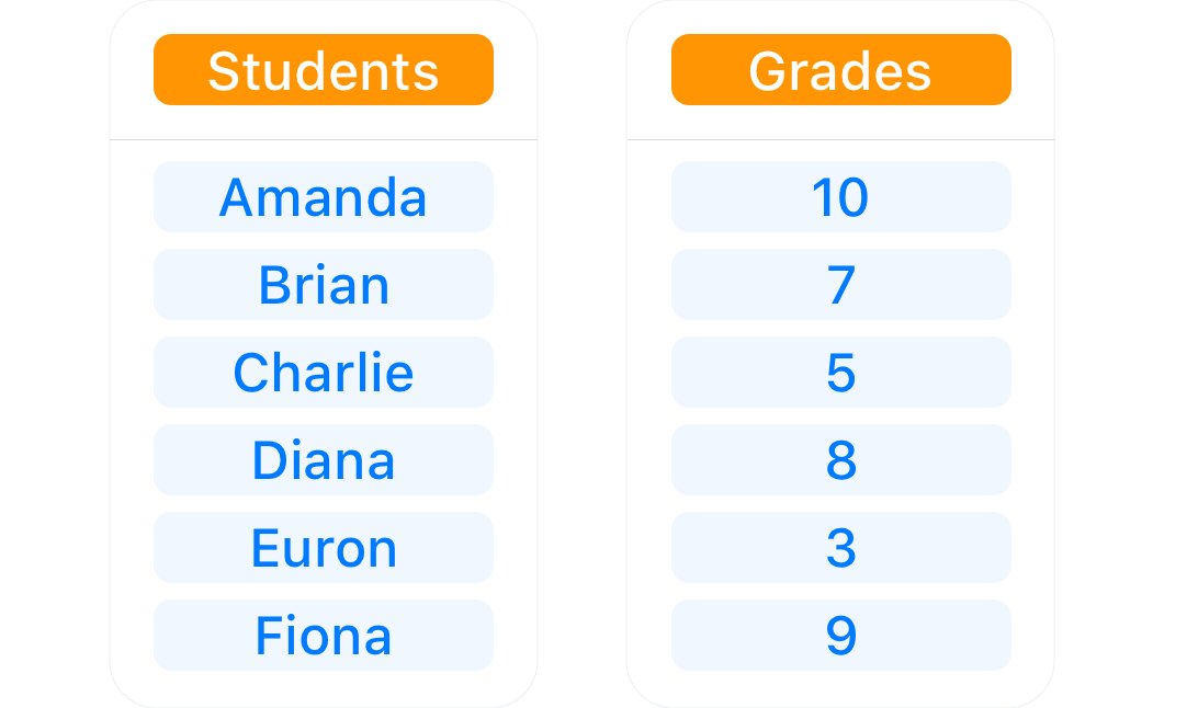
In our hypothetical scenario, our professor has only 6 students named: Amanda, Brian, Charlie, Diana, Euron and Fiona. And they had the following grades on a scale of 0 through 10.
Processing the data
Our shortcut starts with the very basic: getting the data into Shortcuts and processing it.

I've added two Text actions to hold our data: one for the students names, and another one for the students' grades. In order to plot this as a series, we'll have to create x and y lists of numeric values, so Charty can get them and draw everything accordingly.

I've added two Text actions to hold our data: one for the students names, and another one for the students' grades. In order to plot this as a series, we'll have to create x and y lists of numeric values, so Charty can get them and draw everything accordingly.
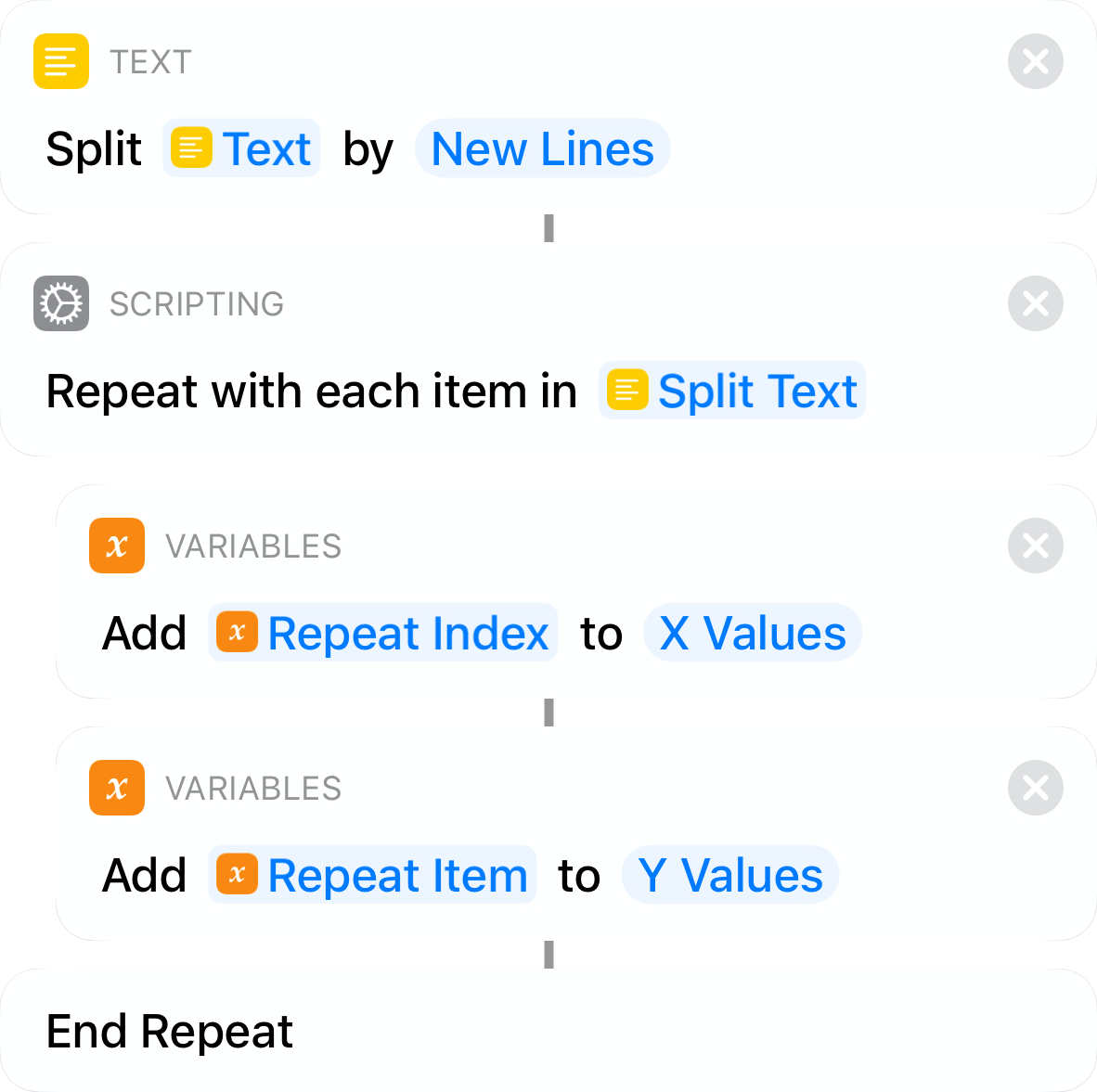
To do that, we'll split the second text with a Split Text action, and we'll attach a Repeat With Each action to its result in order iterate over it.
We'll have to create a list of numbers, with numbers to represent each student. This is necessary because (currently) Charty needs two lists of numbers to generate a bar chart.
In this repeat loop, we'll add the Repeat Index to a new X Values variable, and the Repeat Item (the current student's grade) to a Y Values variable. When this loop ends, we'll have two nice lists of values, ready to be plotted.
To do that, we'll split the second text with a Split Text action, and we'll attach a Repeat With Each action to its result in order iterate over it.

We'll have to create a list of numbers, with numbers to represent each student. This is necessary because (currently) Charty needs two lists of numbers to generate a bar chart.
In this repeat loop, we'll add the Repeat Index to a new X Values variable, and the Repeat Item (the current student's grade) to a Y Values variable. When this loop ends, we'll have two nice lists of values, ready to be plotted.
Adding the series to chart
We'll be using one of Charty's premium actions: New Chart With Series.
You can unlock Charty Premium on the Settings view by tapping on Discover Charty Premium. It'll unlock 7 powerful new actions such as this one, and will also let you style all of your series and axes. You'll also get unlimited series per chart, 27 extra icons and the chance to participate on Charty's First Scavenger Hunt.
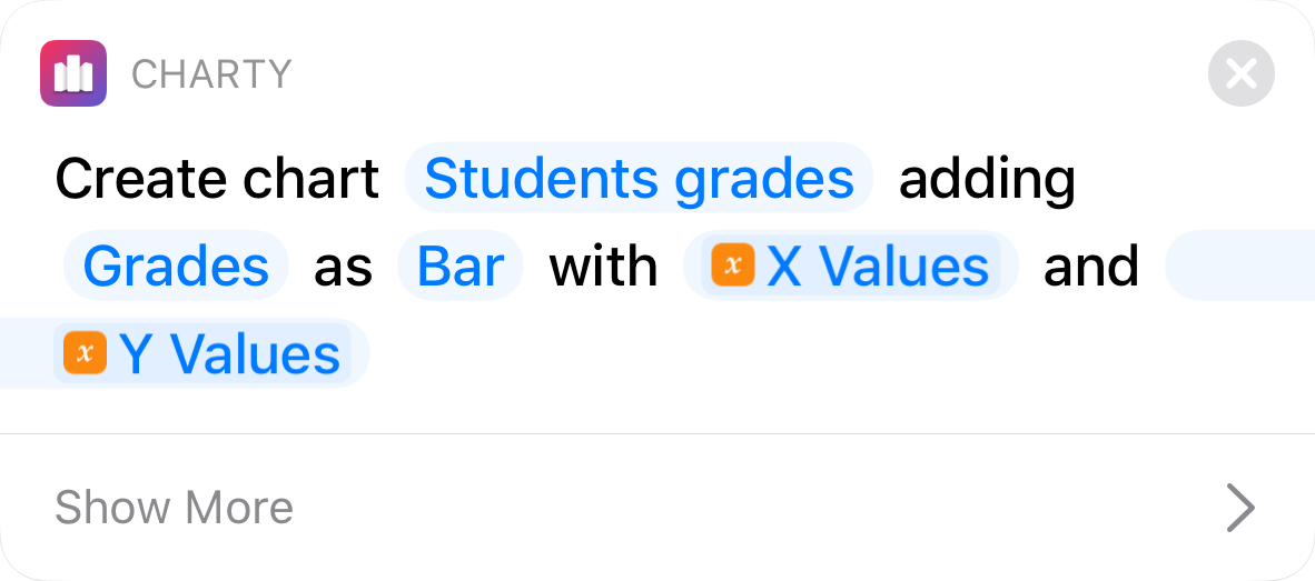
As you can see in the image, we're naming our chart "Student grades" and we're labeling our series "Grades". These are the values that'll appear above the chart and which will be used to reference the series in the legend, respectively.
We've then set the series type to be Bar, and we're adding our variables X Values and Y Values as the plotting values.
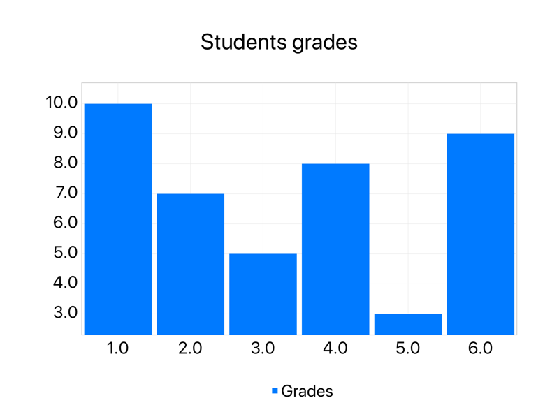
If we run our shortcut now, we'll see a simple bar chart with 6 bars. We're getting there, there's one step missing.
Enter the Style Axis action
We'll be using the Style Axis action to convert our x axis labels from numbers to names.
In order to do this, we'll have to establish a correspondence between the numbers on the x axis and our names, this is done using two lists: the X Values list we already have and a list of names.
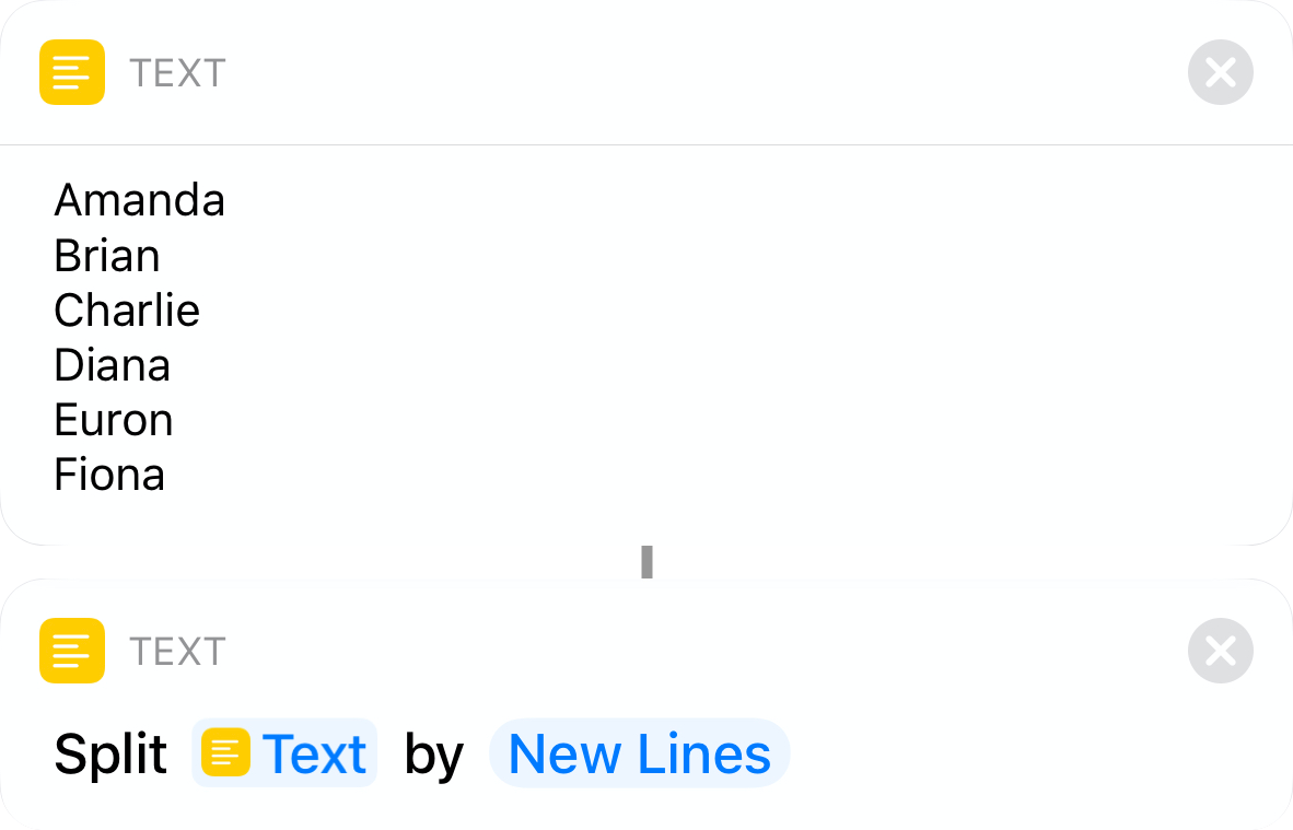
On the first step of this tutorial, we created a text action with all of our students name. The easiest way to convert a text into a list is by using the Split Text action. This action reads the text than breaks into smaller parts based on a given character, which is, by default, the new line character.
As our text action already had one student per line, when it's split based on the new line character, we'll get a nice list of the 6 students' names.
We're now ready to add a Style Axis to our shortcut.
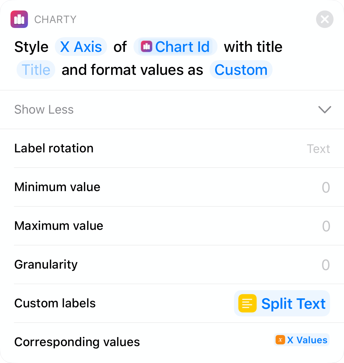
Start by setting which of the axes we want to style (X Axis in this case). If you add the Style Axis directly below the New Chart With Series, the Chart ID field will be automatically filled by Shortcuts. Then, set the Value formatter field to Custom and reveal the other parameters.
There's a lot there, but we only need to set the Custom labels parameter to the output of that Split Text action we added after the students' names text and the Corresponding values to our X Values variable.
Just add an Open App to the end of the shortcut so we go straight to Charty after creating the chart, and hit that play button!
On the first step of this tutorial, we created a text action with all of our students name. The easiest way to convert a text into a list is by using the Split Text action. This action reads the text than breaks into smaller parts based on a given character, which is, by default, the new line character.

As our text action already had one student per line, when it's split based on the new line character, we'll get a nice list of the 6 students' names.
We're now ready to add a Style Axis to our shortcut.
Start by setting which of the axes we want to style (X Axis in this case). If you add the Style Axis directly below the New Chart With Series, the Chart ID field will be automatically filled by Shortcuts. Then, set the Value formatter field to Custom and reveal the other parameters.

There's a lot there, but we only need to set the Custom labels parameter to the output of that Split Text action we added after the students' names text and the Corresponding values to our X Values variable.
Just add an Open App to the end of the shortcut so we go straight to Charty after creating the chart, and hit that play button!
And here is the resulting chart.
