Combining charts for richer visualizations
This post will show how you can use the Combine images action to create richer charts.
The combine images action

In a nutshell, this action combines a list of images (to learn more about lists in Shortcuts, check this video) using one of three strategies: horizontally, vertically or in a grid.
The horizontal option creates a new image by joining the input list of images side by side.

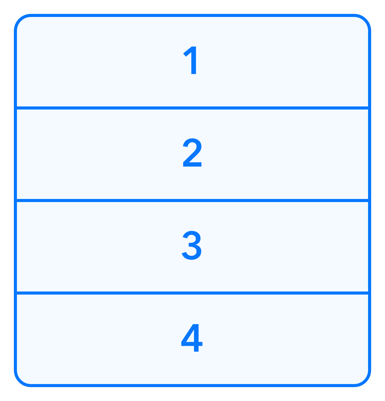
Vertically has a similar effect, but on the y axis.
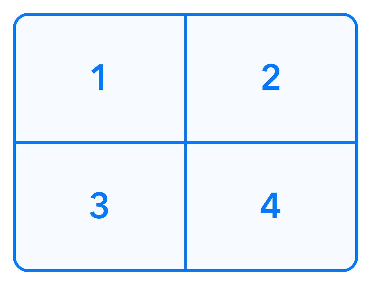
The grid option uses some heuristics to infer the best lines and columns combination. Here are some examples:
- 4 images become a 2x2 grid;
- 6 images become a 2x3 grid;
- 5 images become a 2x3 grid with the last spot empty;
Mixed strategies
Grids are very interesting, but the real power comes from using multiple combine actions to achieve powerful results.
Imagine we have a main chart with data from 3 sources, and we'd like to also present each dataset individually. It'd make sense to show the first chart bigger, while also displaying smaller views for each dataset, like the image below.
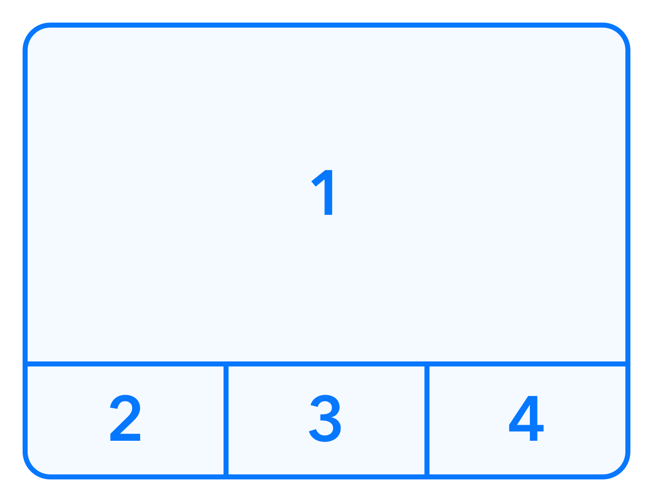
This can be easily achieved using three steps:
- Combine the smaller charts horizontally;
- Enlarge chart #1 so it's 3 times as wide as the others;
- Combine the enlarged chart #1 with the result of step 1 vertically.
Real world example
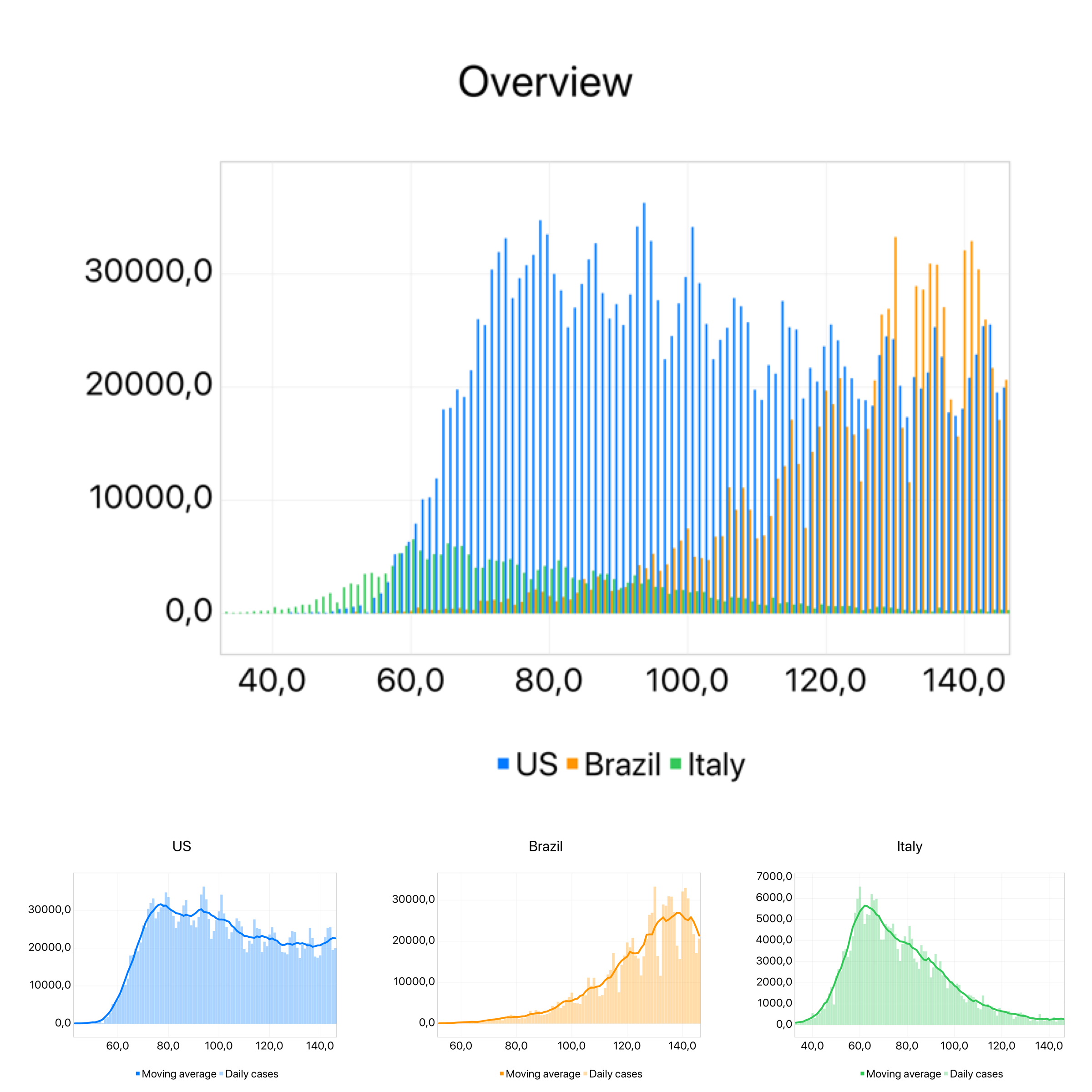
As real world application of this technique, here's an example that uses a COVID-19 API to calculate daily new COVID cases for three different countries: Brazil, US and Italy.
The first chart shows daily data for all countries, while the smaller charts display each country's data, with an added moving average.
